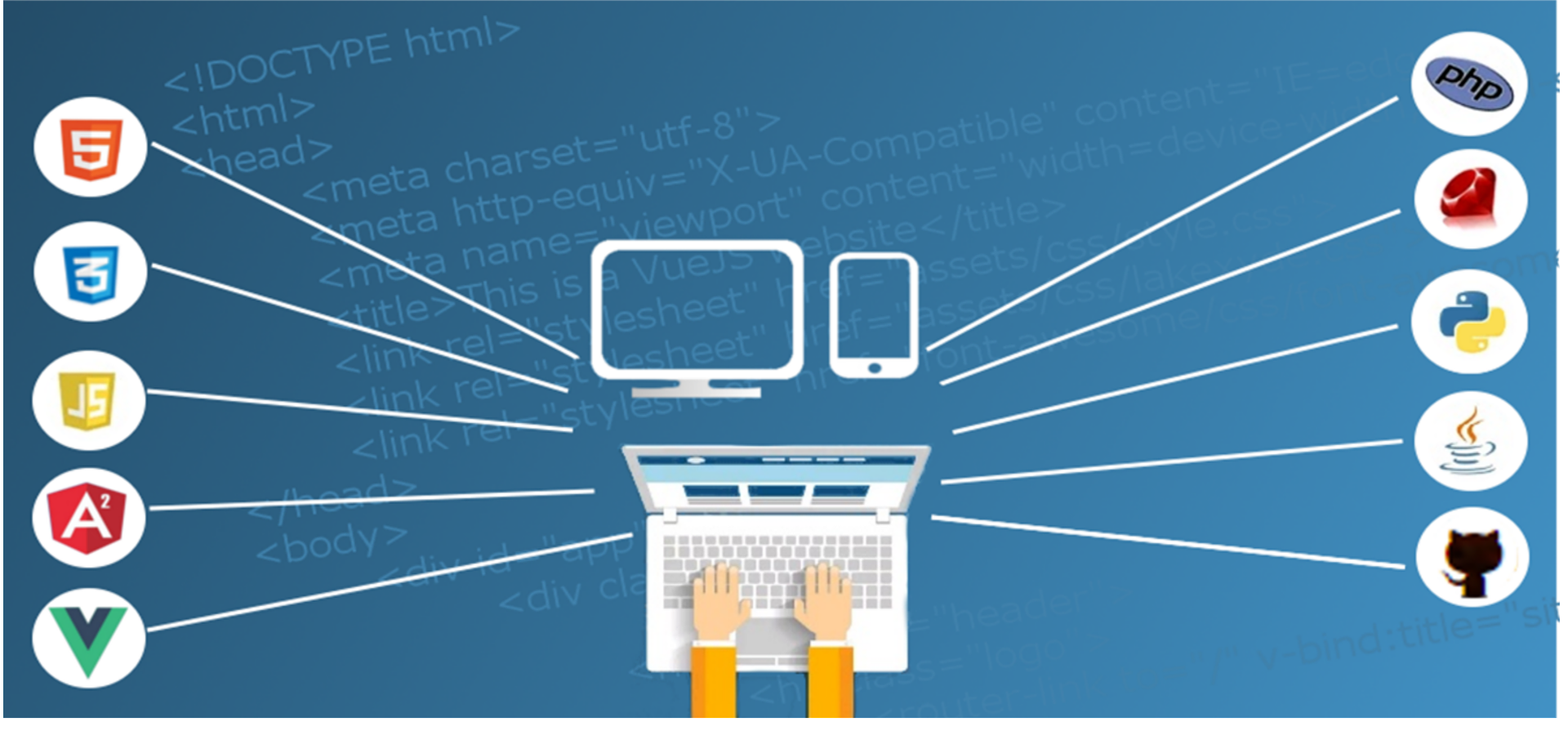
The Internet is a busy place with millions, if not billions, of websites competing for attention. A small business website needs to be tightly focused and well-designed to capture its intended audience.An effective small business web design complements the company’s business marketing strategy by promoting the company brand and enhances customer relationship management strategies.
Small Business Web Design Tips
The colours and images that make up a web page design have the important role of conveying the company brand and the impression a website visitor will take away from the site. The Home page is the most important part of a small business website design. This page will form the visitor’s first impression of the company. This is the place for a big splash of colour that suits the corporate theme and logo. But the inside, or child, pages that contain detailed information should be very simple so as not to detract from the written material. Aim for a pleasing balance of text and graphics on these pages.
Too many colours and the page looks overloaded and busy, too few can be stark and uninviting. A colour scheme should be created from three to five complementary colours that are easy on the eye and translate well on computer monitors of any type. The colours should be pulled from the company logo, if it pre-exists. The header and logo should be eye catching, but use simple graphics design and for sidebars elements everywhere else.
A system for navigating the website is essential for multi-page websites. The navigation system should be simple to understand and use. Coloured or graphic buttons clearly labelled running down one side of the page or across the top are common. Drop-down or fly-out menus can be difficult to use for many visitors and should be avoided.
Content Tips For a Small Business Website
Trend of outsource content creation is very popular nowadays as it offers smooth and hassle free content service. Reliability of outsourcing is increasing in today’s world. So don’t forget the importance of the written content in the web page design. Text that appears on the computer screen is read differently by visitors than the way text printed on paper is read.
Website visitors will not read long stretches of text. Break up text into small chunks with paragraphs of 75-80 words or less. Use numbered lists or bullet points to give out simple facts and figures.
The next website is just a click away the second a visitor decides. Make sure the content is concise and to the point to keep the reader interested.


